- On Student Success
- Posts
- Student Success Charts
Student Success Charts
A quiet month of uncomfortable data
Glenda Morgan
February 26, 2026

Was this forwarded to you by a friend? Sign up for the On Student Success newsletter and get your own copy of the news that matters sent to your inbox every week.
This is the second in my monthly (roughly) Student Success Charts posts where I share charts and graphics that have caught my eye in the past month.
Unsurprisingly, the charts this month are not cheerful. They tell a story about labor markets tightening unevenly, degrees decoupling from earnings, platforms drifting away from universities, and systems aging in place. I’m not going to over-interpret them. But I can’t stop thinking about them.
Returns, Risks, and Relative Decline
A striking John Burn-Murdoch chart showed that the UK is one of the rare cases where the earnings premium has declined as higher education has expanded.

Oversupply? Or economic under-performance in creating high-paying jobs?
Either way, the relationship between participation and payoff is not automatic.
The Economic Policy Institute showed employment losses for under-represented groups.
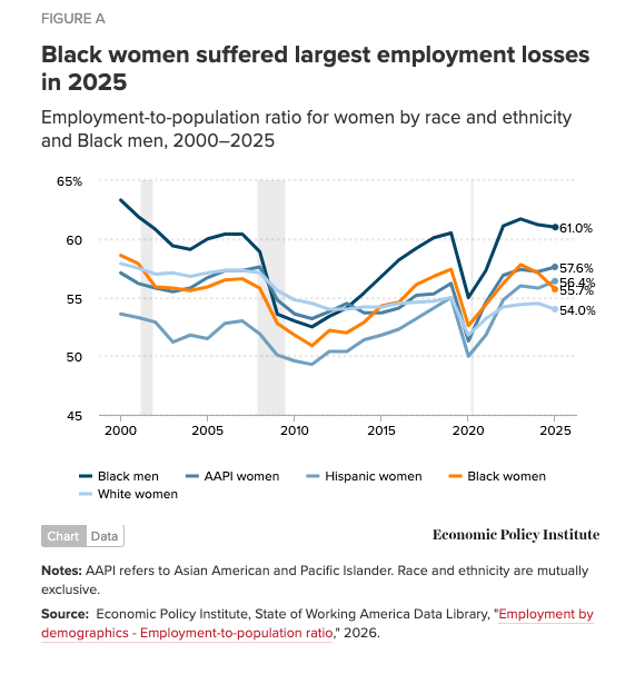
Black women with bachelor’s degrees were especially hard hit.

The EPI ties this directly to federal layoffs — a sector where Black workers are disproportionately represented among degree holders.
Even a degree does not fully insulate against sectoral shocks.
And the US is falling further behind China in terms of first science and engineering degrees awarded.

Expansion at home. Acceleration elsewhere.
Quiet Realignments
In 2025, 84% of new Coursera courses came from non-university providers.

That is not a rounding error. That is a platform redefining its center of gravity.
Universities built the early MOOC ecosystem, but they are no longer the dominant suppliers inside it.
Meanwhile, the K–12 teacher workforce continues to age.

Source: Michael Marder
The bulge has moved steadily to the right. Fewer early-career teachers, more late-career teachers.
Pipelines tighten and replacement gets harder.
And Britain has become markedly less attractive to educated young movers.

Relative positions may shift again, but for now, the direction is clear.
Institutions age.
Platforms pivot.
Talent flows elsewhere.
Ideas That Refuse to Die
Why do weak ideas persist?

Source: Dave M
Because they are psychologically sticky, socially reassuring, and institutionally convenient.
Data alone rarely defeats incentives.
I had forgotten about the Spurious Correlations site. There are quite a few education-related spurious correlations.

Correlation is cheap. Causation is expensive. And education debates are not immune.
From the Awful Chart Collection (ACC)
And then there are charts that simply defy comprehension.

Not all data clarifies. Some of it obscures.
Parting Thought
More next month.
The main On Student Success newsletter is free to share in part or in whole. All we ask is attribution.
Thanks for being a subscriber.